AP reFlection
Oh sweet mother it's finally over. Well it's been a year it's crazy how fast it seemed to go by. I would've never thought that I would be in Ap Art I didn't think I was ever good enough. But throughout this past year I have learned so many different techniques and how to use different art materials but I'm going to use for the rest of my life. I'm so glad I took this class because they're just so many things that I didn't know that I needed help with it helped me focus on details and becoming a faster worker and taught me to think outside the box.
Thank you so much Mrs Rossi for always being so hard on us to get stuff done because it really pushed us to do our best well helping us find our style. We have all accomplished so much in this year. Emma D is making a children's book like that's crazy. We would've never guessed something like that would've happened at the beginning of the year. I actually made something with colored pencil compared to earlier this year when I would avoid using them same with oils, but now I know how to use those materials. I love and appreciate all the opportunities this class has given me and I am so glad I took it.
Thank you so much Mrs Rossi for always being so hard on us to get stuff done because it really pushed us to do our best well helping us find our style. We have all accomplished so much in this year. Emma D is making a children's book like that's crazy. We would've never guessed something like that would've happened at the beginning of the year. I actually made something with colored pencil compared to earlier this year when I would avoid using them same with oils, but now I know how to use those materials. I love and appreciate all the opportunities this class has given me and I am so glad I took it.
portfolio
Concentration
Concentration Summary
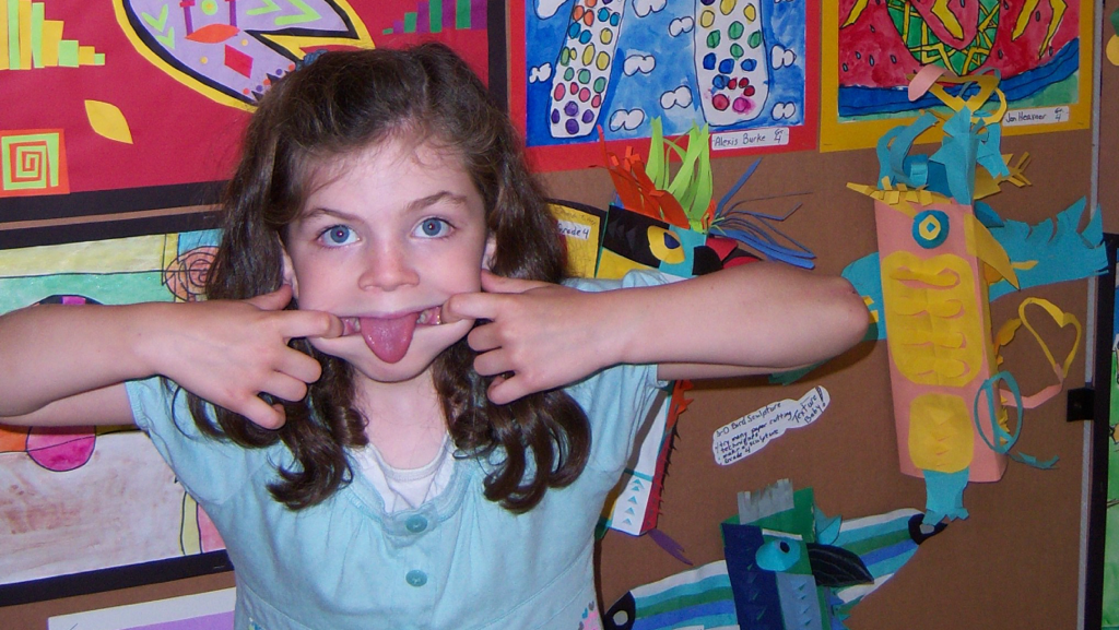
My concentration is a series of picture of my siblings and I at the ages of 3, 7, and 12. This progression of our ages shows how our personalities develop. The size of the pictures grow as well with the ages.
Concentration Description
The 3 year old pictures show us at an age where we didn't have a fully developed personality and we were told how to act. I show that by making portraits show us sitting still and looking at the camera. The 7 year old pictures show us starting to develop personalities. For my older sister and I, (7&8) it is just our faces that show how we were growing up. She was the oldest and more mature which is why she has a calm face with a smile that she has always done. In my picture, my silly face shows I'm the silly sister the younger ones look up to. In the younger sibling's photos they were making silly faces as well. Kelsey (6) would make that specific face in almost every picture she was in at that age. For my brother (5) at that time he had 4 different teeth missing. The top front ones were knocked out when he fell in the street and didn't grow back for a couple months. The 12 year old pictures show how what kind of people we are and hobbies we have. Luke (9) loves to be in the action and likes sports based activities. Kelsey (10) loved to bake and made a cake about every weekend. I was learning guitar at this and my picture (11) showed me at my school talent show singing and playing. Layne's picture (12) gives an example of her great imagination where she would always love playing dress up. The pictures get bigger in size as well.
Breadth
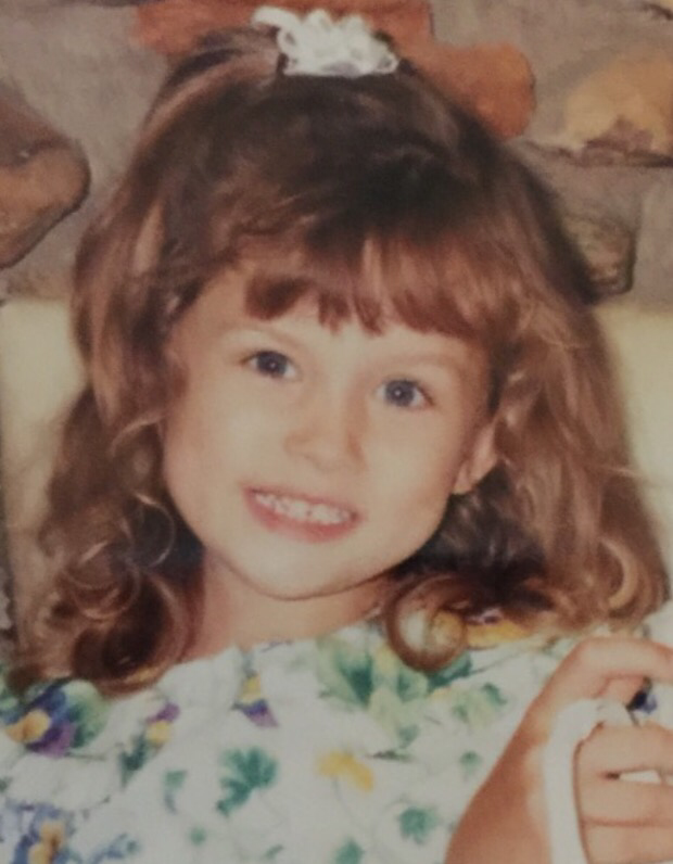
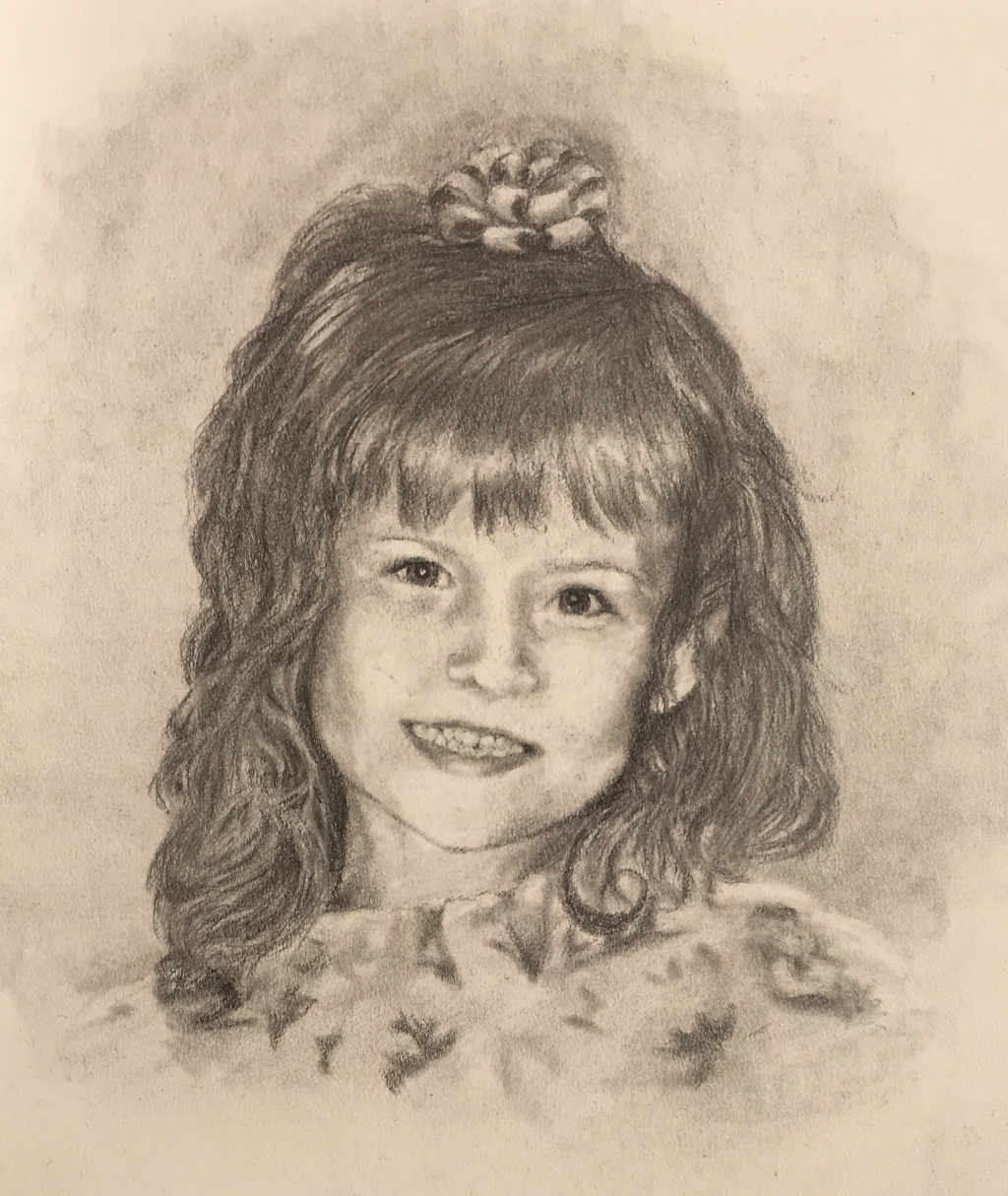
Concentration #12 - layne Age 12
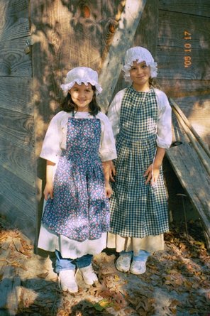
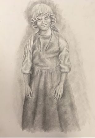
I think this is my favorite out of all the 12 year old pictures. This is my sister when she was 12. This picture was taken when we went to a old colonial site. Where the staff taught us how the colonists lived and what they did for fun. We got to make buffalo bone bead necklaces, do some play sword fighting, and a dress up like the colonist.
I really think this picture shows off Layne's personality. The whole time at this one place she just had so much fun. I think your best memory of going there was actually beating the sword instructor when it was her turn to go up against him in a fight. Also Layne was always being very creative and imaginative. One of her most favorite games was house and she loved any game where you would have to dress up.
I really like how the picture came out I think I need to maybe define the wrinkles A little bit more in the dress and lighten up her face. But besides that the proportion and details are great.
|
|
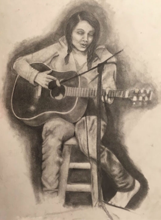
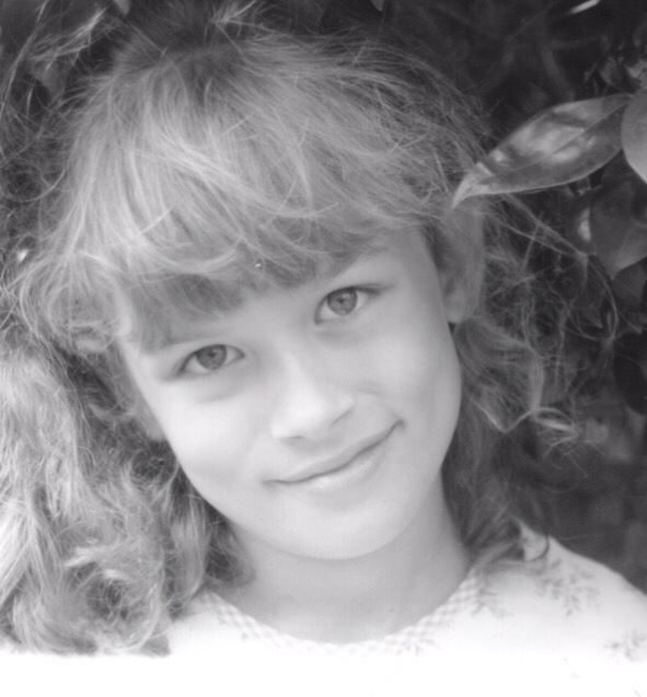
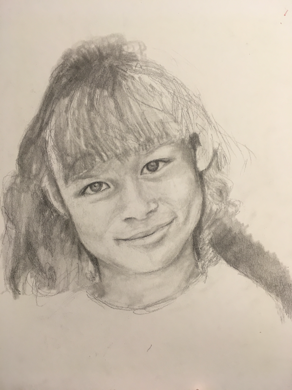
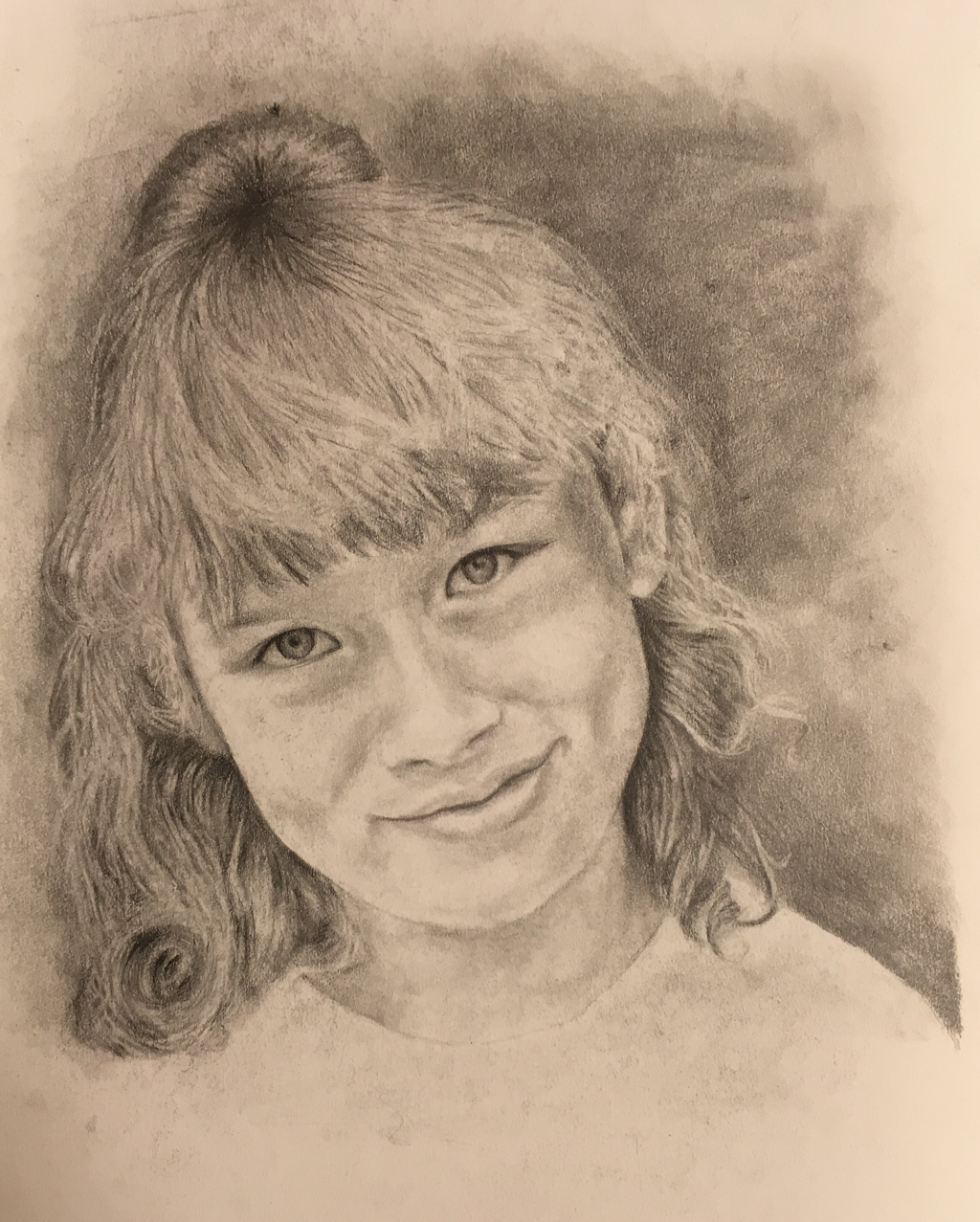
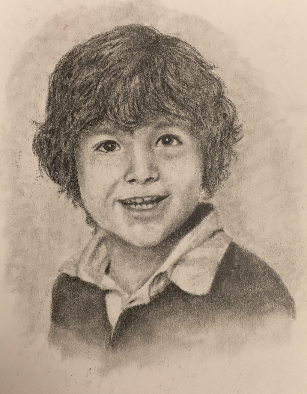
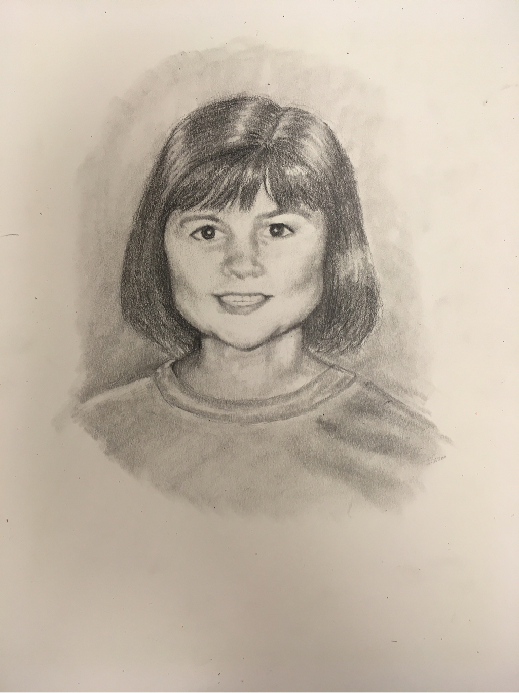
concentration #11 - Morgan Age 12
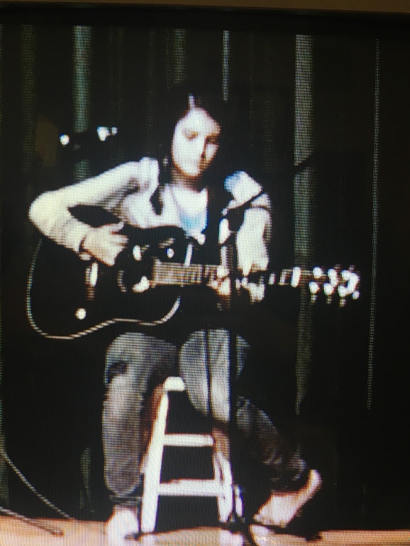
This picture is me at the age of 12. When I went Apex middle school they would have a variety show at the end of each year. This is just a picture of me on the stage playing my guitar and singing. Around sixth grade was about the time that I started learning how to play the guitar and I have always been a singer.
This really shows my personality because I am the artistic women in my family not just Art wise but music wise as well. Being the middle child I always had someone older than me and somebody younger than me. My older sister would be the first to do everything so she would get attention for my parents because they needed to learn these new things for the rest of the kids. I have two siblings under me Who and they were younger we would get the attention because they needed to be looked after. So I was in the middle and needed some way to get my own attention so I just became the talented one and some how good at a lot of things.
In this picture I think that definitely a few things can be changed. I got the picture from a video my mom took because we didn't have any pictures of me singing. We played the video and I had to find a good place to stop at to take a picture of the screen. This is why it is so blurry. But I can probably go back and find some old Photos that shows my face in more detail so I can go off that you're not a blurry screen. Over all for coming off of a old TV screen playing a video from a VCR I think the drawing came out pretty well.
|
|
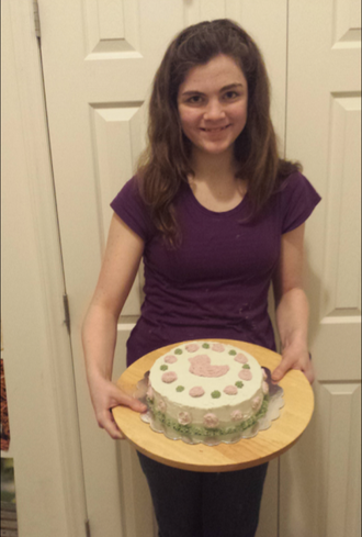
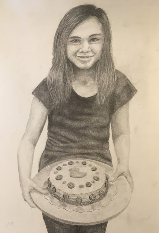
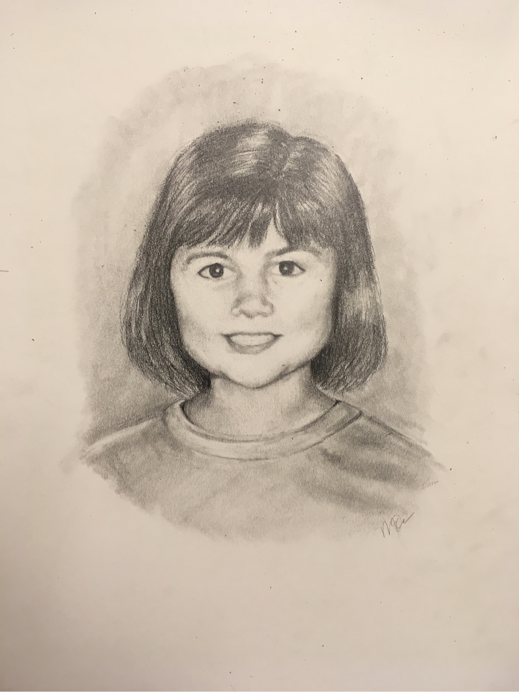
concentration #10 - kelsey age 12
this is Kelsey's told you a picture. Here she is holding the first cake that she has ever made. For some reason they wanted it to be duck themed so there is a duck made out of sprinkles on the top. At this time in Kelsey's life she was really into baking she still kind of is but now she's more obsessed with Harry Potter and Pinterest. But when she was 12 she would always be baking something either one day after school on the weekends but every week she would make something new. This shows kinda how she is and how she is a very cliché house mother type of person and she loves things like baking organizing taking care of babies and she's always been like this. She begged my mother on spring break to let her clean out and organize the garage, and begs me to let her help clean my room whenever it's really dirty.
I think the picture really came out great though I might have to change her face a little bit just to make it look like her a little bit more but I had to change the face not to look like the one in the picture because she looks super creepy and like she staring into your soul so my mom wanted me to change that. But I think besides the face the rest of it came out really well especially the cake and the reflective platter underneath the cake.
I think the picture really came out great though I might have to change her face a little bit just to make it look like her a little bit more but I had to change the face not to look like the one in the picture because she looks super creepy and like she staring into your soul so my mom wanted me to change that. But I think besides the face the rest of it came out really well especially the cake and the reflective platter underneath the cake.
|
|
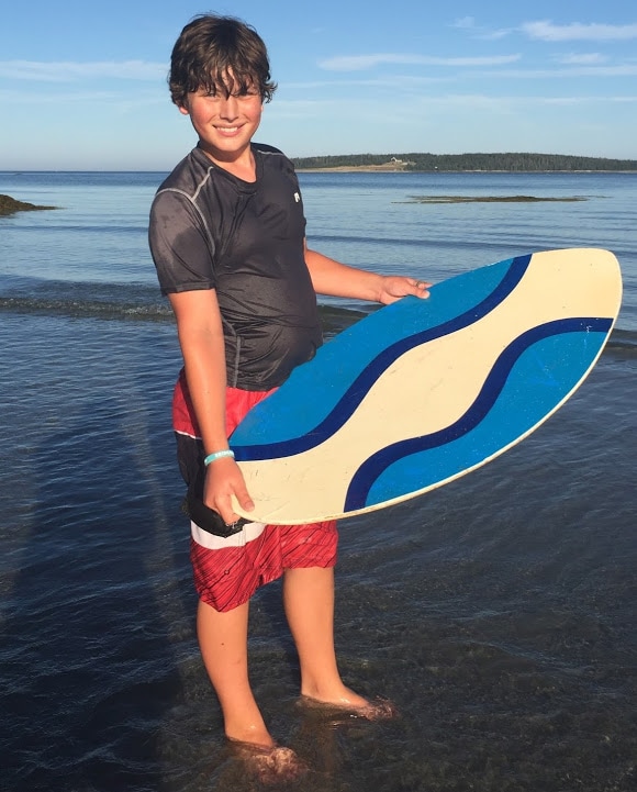
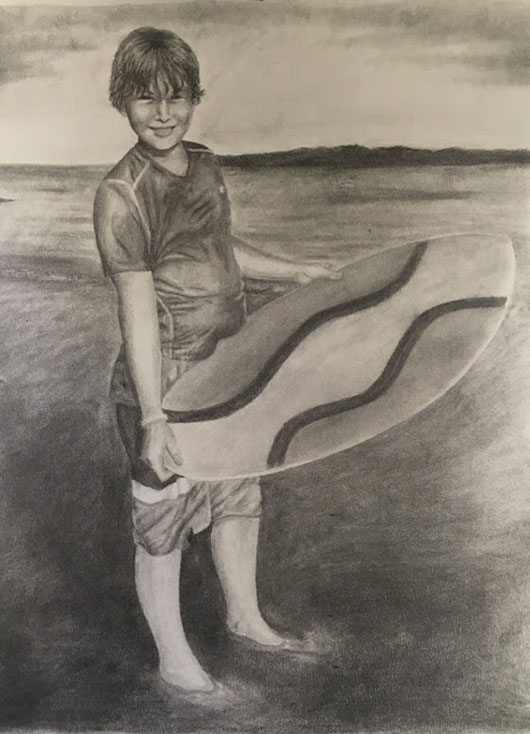
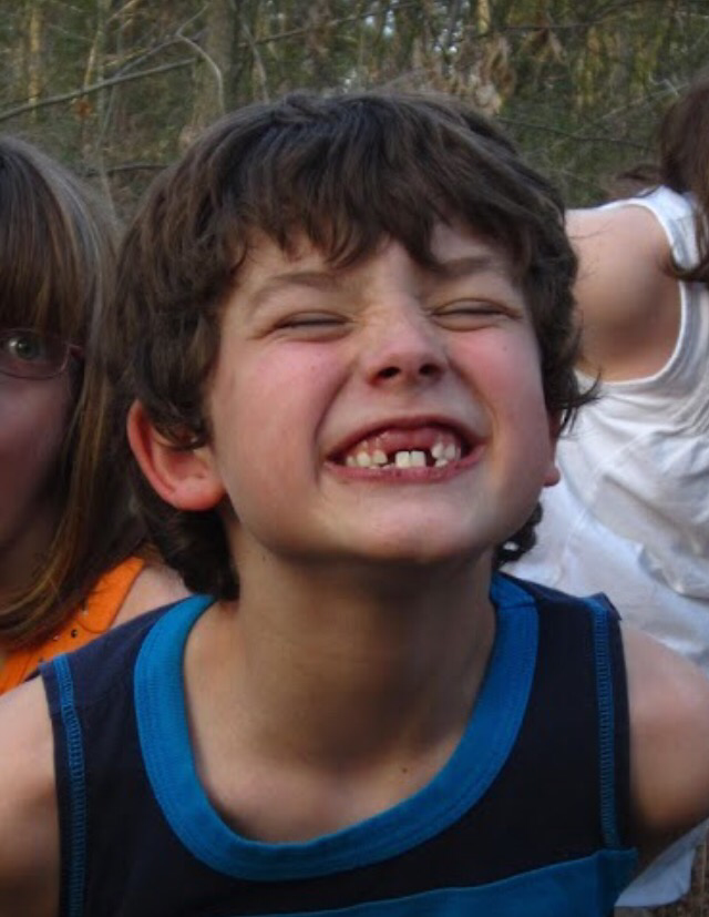
concentration #9 - Luke AGE 12
This is Luke's 12-year-old picture. Here he is up and Maine. This is a beach called drift in and it's one of our most favorite beaches in the Maine. The beach is up there are differences in the ones down here they do not have big waves and long sandy beaches it's mostly just little Coves with some sand but a lot of rocks to climb on. The tide up there's a really cool too because most of land is a very level and so the tide seems to come in quicker but it covers more land than a beach down here would. So when the tide is in it covers the entire beach but when the tide is out The place that might have been over your shoulders is now out of the water. The entire time we went up to Maine this past summer Luke was looking for a skim board. It's a board where do you throw it onto shallow water and then jump on it and it'll basically hydroplane you across the beach. He found one at this old junkyard shop called Larry's where they take things that they can salvage and sell it just so useful things aren't thrown out and they can be reused.
Being the guy Luke is more into smart sports then the three of us girls. He is very hyperactive and always needs to be doing something. When he finds it thing to do he will spend all this time trying to master whatever it is until he was fairly good at it.
This is the first 12-year-old drawing I did. I didn't really know how big to make it or really what to do until my mom found this picture and I just used one of the large illustration boards. Really the only thing that I would change on this would be the ocean in the background maybe add some more highlights in there or more detail on the small waves and his eyes. I need to make his eyes look the squinty and dark.
|
|
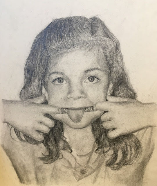
concentration #7 - Morgan age 7
So this one is a picture of me being my normal silly self at the age of 7. This was cute to me, because of the expression on my face. This was a pretty easy picture to draw. First I started with the eyes like I always do just because they are usually the darkest thing in the whole picture. Next I actually moved onto the mouth which, like Kelsey's, where that hardest thing ever to get right. My teeth, like Luke's, were significant to me at that age. They were really twisted in the front till I got braces in 6th grade. Another thing was the shirt I was wearing in the photo. I would wear that shirt all the time and it had little matching pants to go with it.
The giant came out really well I think this is another one of my favorites out of all of them just because of how much it looks like me. I'm I have to go into more detail around the mouth just to make the lips look a little bit more realistic but besides that I think everything in the picture is pretty consistent with the photograph.
The giant came out really well I think this is another one of my favorites out of all of them just because of how much it looks like me. I'm I have to go into more detail around the mouth just to make the lips look a little bit more realistic but besides that I think everything in the picture is pretty consistent with the photograph.
|
|
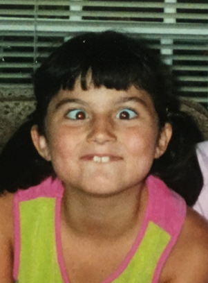
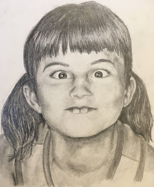
Concentration #6 - Kelsey Age 7
For this piece continuing with the theme of siblings this is Kelsey at the age of 7. this is probably my second favorite picture. I love how detailed I made it and it really shows off her silly personality. Like the other picture it shows how she is developing more of a personality and becoming her individual self. At this time she would make this face in every picture she took so might as well use a picture displaying something significant in her life at the time.
I think the hardest thing about drawing this picture is the mouth. Oh the mouth, you would never know that its so hard to just shade a mouth if you did everything else ok. Oh no. when there is a side angle of teeth that make them look weird in the picture anyway and lips that are kinda curled but not really but then really stretched out it gets pretty hard. With much, Much trial and error it worked out eventually weird teeth and all.
I think the hardest thing about drawing this picture is the mouth. Oh the mouth, you would never know that its so hard to just shade a mouth if you did everything else ok. Oh no. when there is a side angle of teeth that make them look weird in the picture anyway and lips that are kinda curled but not really but then really stretched out it gets pretty hard. With much, Much trial and error it worked out eventually weird teeth and all.
|
|
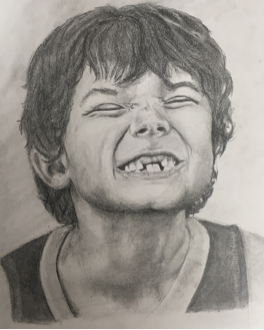
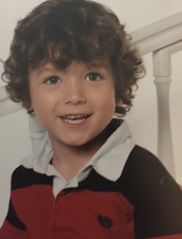
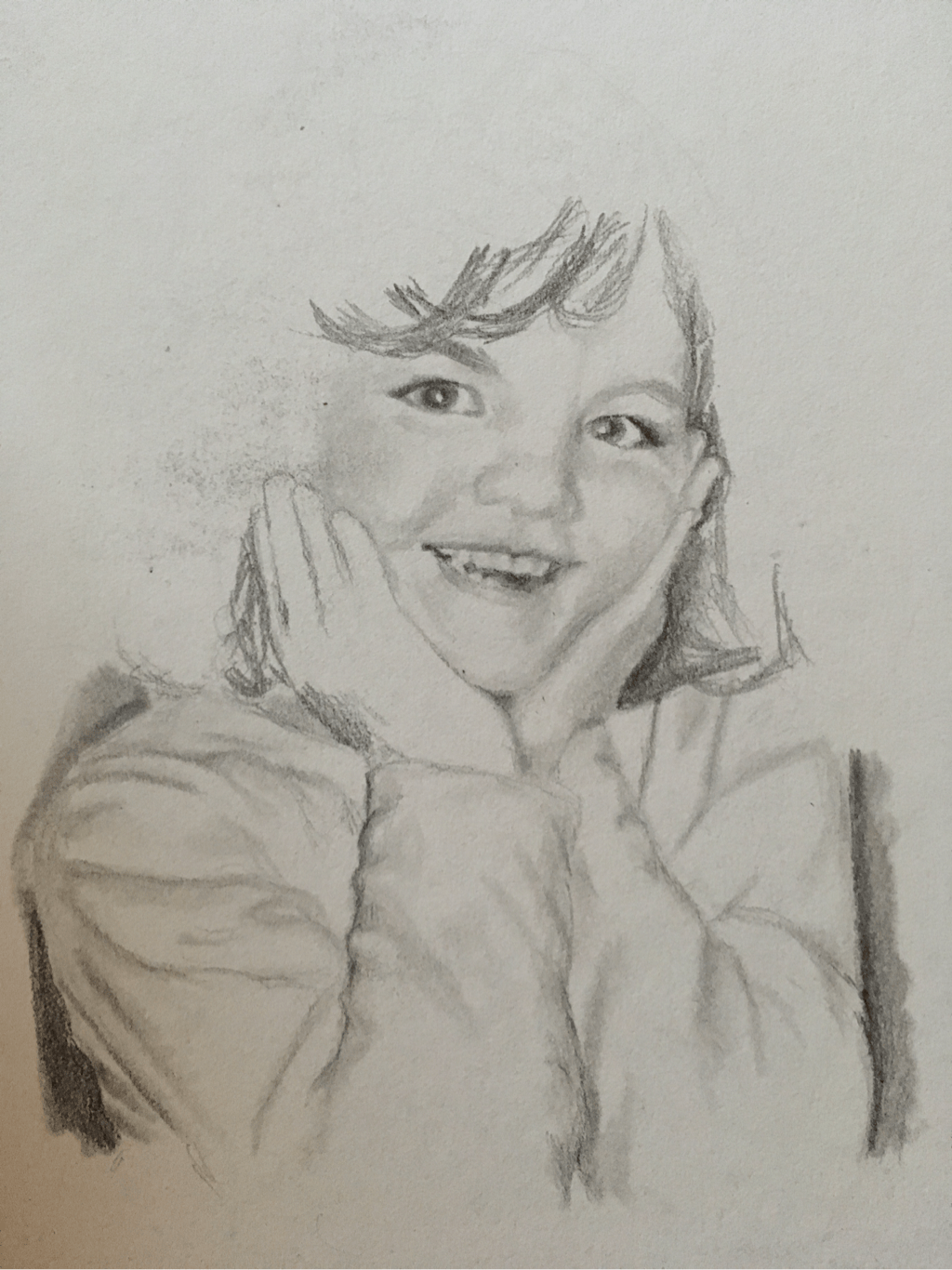
concentration #5 - LUke age 7
This is by far one of my favorite drawings yet. It just looks so realistic and I love it. the expression on his face really cute and mischievous which completely shows of his personality at that age.
For this drawing I used my posterizing and grayscaling method like always :). This time I started with the hair and the mouth at the same time. I love how they both came out and how the movement in them are clearly visible making look even more realistic than my other pictures. One of my favorite parts of this picture are the teeth or the lack thereof. it just makes him look so adorable. Next I moved up from the mouth to the nose and the creases caused by his smile also adding to the movement. Next I moved on to the hair and here is where I spent most of my time on the picture. I love how I got the waves in there but I really think it could use more texture and highlights. At the moment it just looks flatter than it should. After the hair I finished it up by adding the highlights and shadows in his ear, neck, and on and around his shirt.
Before this picture I was just going to make the rest of my pictures like the first four. I thought about it and it just seemed to boring. I wanted my concentration to have a deeper meaning than just the picture size getting bigger as we grow up. I didn't really know what I wanted to do different till my mom showed me a picture of my younger sister making a silly face. When Kelsey was younger she would make this face all the time where she would stick her pointer finger in her mouth and pull on the corners of her mouth while sticking her tongue out. I wasn't just this picture that she did this in.
This face was just her go to face all around the age of seven. This gave me the idea to add things that add our personality. Even though I had already done the first five picture I re-established me concentration. The drawings for age three are going to be are going to show a time when we were told how to act and hadn't started to develop our personalities yet. Next, at seven years old, I decided to make us start to develop a little personality. Last, the twelve year old picture are going to be the time where we have mostly found ourselves and have taken up hobbies.
The significant thing about Luke's teeth is that at that age he had tripped while running on the road. When he fell he had hit his front teeth on the curb. This knocked right tooth out and pushed the left on in. After he lost the left tooth he didn't have front teeth for about 8 months, because they had been pushed in. This was a big significant part of his 7 year old life so I made sure to incorporate them in the picture.
The significant thing about Luke's teeth is that at that age he had tripped while running on the road. When he fell he had hit his front teeth on the curb. This knocked right tooth out and pushed the left on in. After he lost the left tooth he didn't have front teeth for about 8 months, because they had been pushed in. This was a big significant part of his 7 year old life so I made sure to incorporate them in the picture.
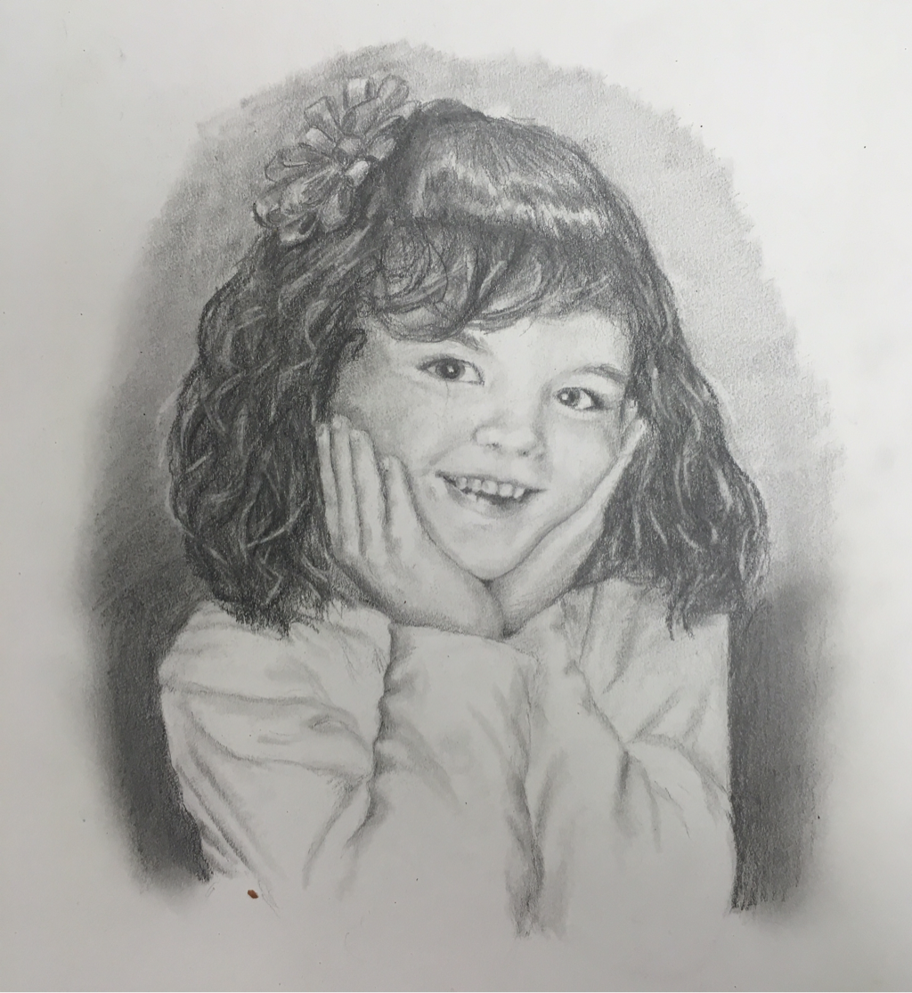
concentration #8 - layne age 7
Concentration 5 WHOO HOO!!
For this piece I decided to start this one by not using my posterizing and grayscaling method. This was hard. This time I drew this freehand. This was hard for me to start, but it got better as I worked on it.
Because this was the first of the seven year old drawings I thought about how I could make my concentration better. I decided it would be cool to make the pictures bigger. The three year old pictures are 8x8 and I wanted to make each stage bigger than the last. So the seven year old pictures were going to be about 10x10 or 12x12 and the 12 year olds would be 14x14 or 16x16.
In the end I had to start over, because it just ended up looking like Bindi Irwin. Soooo I started over and this time I had better luck with the proportions and it ended up looking a lot better.
I really love how this one turned out, but unlike the 3 year old picture of Luke I need to make the hair darker rather than lighter. I loved the how the hair is around the face even if the hair on the top of the head is to light. I'm really glad I started over it would have taken so much longer to fix the first one. I started with the eyes as usual and worked around the face. then I went onto the hair and
concentration #1 - Luke age 3
Yyaaayyy!! Concentration 4 we made it. Just like always I started with the posterizing and grayscaling the original picture. This time after starting with the eyes I went to the hair. I tried to make it look fluffy but I need to go back and add some light hairs that stand out. Then I moved on to the nose just to work on something easy after the hair so that went fast. Next I fanned out to the rest of the face. I finished the teeth after that which I love. Lastly I moved on to the shirt. I really love how the shirt came out. It really came out nice with the depth in it.
Things I need to work on are the hair, the eyes, and the brightness of the face. The hair is a little to dark and there aren't any visible highlights that make it stand out. The only thing I need for the eyes are just make them a little bit darker so they don't look so small. The face just needs to be brightened a little so it doesn't look so flat and so it doesn't blend into the darkness of the hair.
concentration #4 - Layne age 3
To keep with the theme of my concentration I drew my older sister Layne at age three. Also continuing with the second theme I finished this so quickly I forgot to take progress pictures. Instead of visually showing the process and making it easy I will have to explain the process in words.
First I did my usual process with posterizing and grayscaling to get the correct proportion. Like always I started with the eyes and the outside other face just to get the darkest parts of the drawing out of the way. This makes it easier later because the graphite you use in the dark areas can be picked up with a blender and spread out to the lighter parts of the drawing so you don't have to use a pencil for the rest of the drawing unless you really need to.
I think the hardest part of this picture was drawing the hair. There were so many different darkest and lights so there was a lot of erasing and fine line. My favorite part of it are the teeth them being so imperfect makes it them look even more realistic. Though it was hard I also enjoy the hair a lot. All the layers make it so 3 dimensional and realistic. I might have to go back and change the nose a little, because it looks kind crooked. Besides that I'm really happy with this piece.
Color pencil challenge gumball macHine
This project was for the Color Pencil Magazine color pencil challenge. This is where an artist uses colored pencils to create their version of a photo provided by the magazine. This months challenge was drawing a gumball machine.
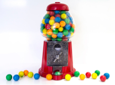
when I saw the picture I thought I would be cool to do it from a different angle. I chose an angle that was about 45 degrees above the normal perspective.
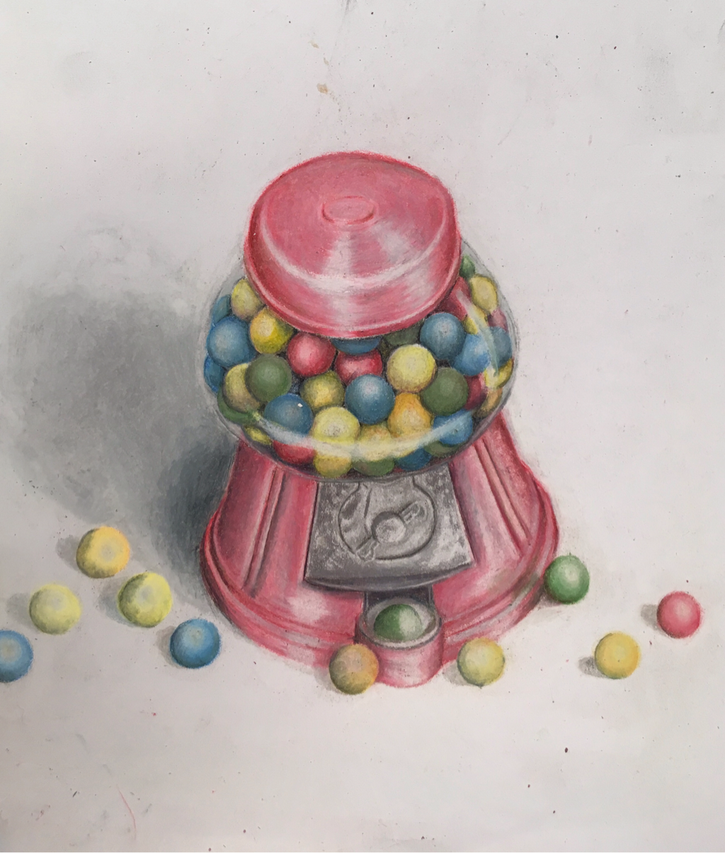
I like and don't like how this turned out. I like it, because it has all the right colors, the blending is really nice, and I really love the depth inside the glass part. What I don't really enjoy about it is it lacks realism in some areas. Parts that's arnt as real as others are the metal part in the middle, the gumball sin the machine and the dispenser. Those things just make it seem just a little bit cartoonish. The perspective really can out well the only thing I would change would be bring the base of the machine back or make it longer, because it looks just the tinyest bit off. Over all I really enjoyed doing this little side project. It gave me something to do in my other classes and it helped me work on using colored pencils and a medium.
concentration #3
-morgan age 4
This is the second picture I have done for my consentration. So for it's going pretty well. My mother wanted to mix things up a bit with my picture, because she loved my face in the picture above but my hair is all messed up. In the picture below she liked the hair so she asked if I could combine the two and draw the second pictures hair on the first pictures face.
I did my method of posterizing and grayscaling the main picture. I just decided to trace the face and leave out the hair then later free hand the hair.
In the picture below is my outline/first draft. It gave me a base to work on and change. I didn't realize how bright my face was in the original picture which made it pretty hard to shade in the cheek and eye area.
In the picture below is my outline/first draft. It gave me a base to work on and change. I didn't realize how bright my face was in the original picture which made it pretty hard to shade in the cheek and eye area.
I look really stressed out and tired in this one with deep under eye circles and unnaturally contoured face. I definitely need ed to work around the eyes with not only the dark circles but with the crease of the lid. Other places that needed work were the nose and jaw line.
I ended up taking out the eye lid creases and a lot of the under eye circles. I also added the neck and the shirt in and put more details into the hair. Another area I worked on was the nose. I had to go over it a couple times to get the correct shading on it. After the nose I started focusing on probably the hardest part of this project the mouth. In the past I have been about to handle drawing teeth, but the small size on the teeth and the brightness of my face in the picture it was hard to even see where they began and ended. Also my lips were pretty hard to. Back then I would kind of curl my top lip in when I smiled so the lip line was very thin, but you could also see my gums. It's hard to find the kind between my gums and my lips, because they're so similar in color. The shape of my lips are really weird to they're very curvy and if I changed the angle of anything it would make the whole thing look off.
In the end after I lightly erased some of the shadows around my nose cheeks and and neck it really made it look so much better and not so exaggerated. I really like how it actually looks like me, but I feel like I can definitely go back in later and change things ass I see them
concentration #2
-kelsey age 3
This is my first piece for my consentration that I have done it was a picture of my sister Kelsey at three years old. My complete concentration is going to be me and all my siblings at different ages. there are four of us so if I do three different ages (I chose ages 3, 7 and 12) then I'll end up with 12 different pieces. It's going to show how we have changed and grown up throughout the years and how different but similar we look to our younger selves. I really enjoyed drawing it. Drawing this picture really set up how I was going to do all my other pictures. The size of the faces need to be about the same as well as the size of each drawing board. It was really nice and they and how it just all came together. I showed it to my family and they say it actually looks like my sister Kelsey.
I really like the concept of mine concentrations because it shows how we have grown throughout the years. I have decided that each drawing board is going to get bigger for each year. So the three-year-old pictures are going to have a smaller drawing board in the seven-year-old pictures in the sevens are smaller than the twelves.
I really like the concept of mine concentrations because it shows how we have grown throughout the years. I have decided that each drawing board is going to get bigger for each year. So the three-year-old pictures are going to have a smaller drawing board in the seven-year-old pictures in the sevens are smaller than the twelves.
I think the hardest part of this piece was her hair. It is always been super curly especially when she was younger. I finished the picture but then my mom wanted me to go back and put a little bit more detail and curl back into the hair because it looks kind of flat. I really think that was a good idea because it really finish the piece and made it look more realistic.
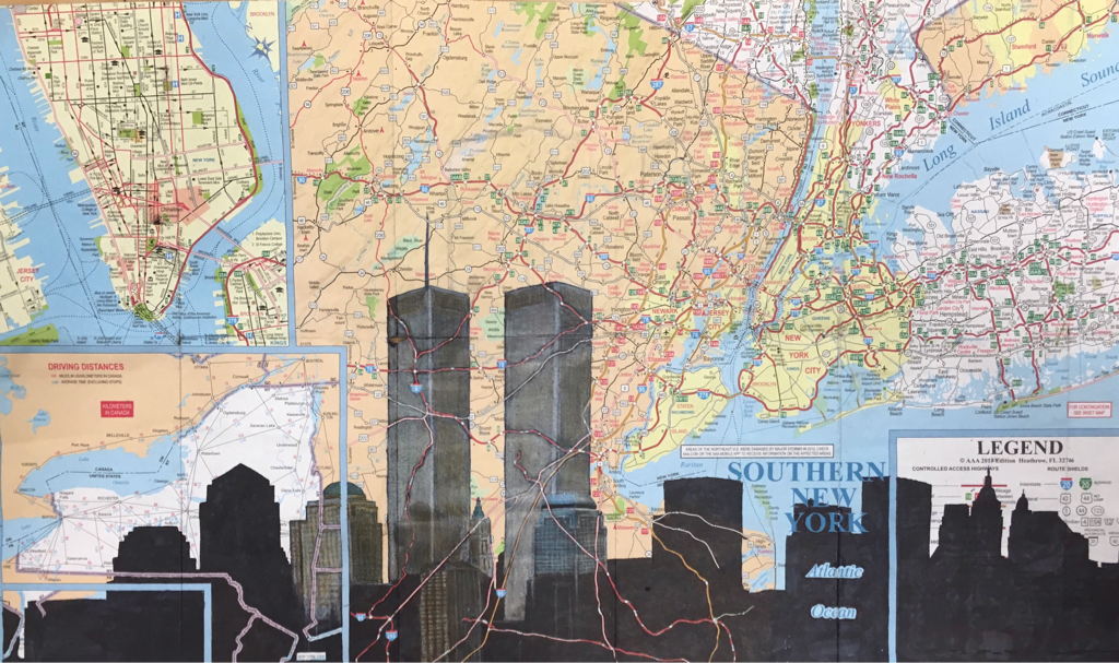
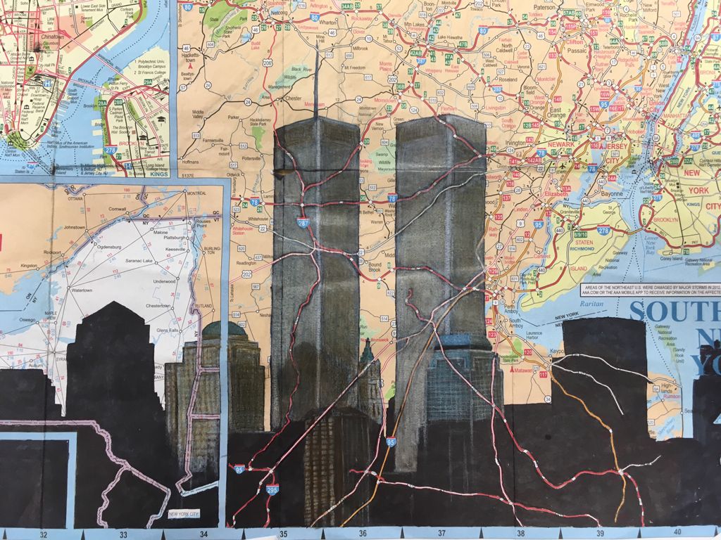
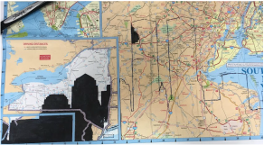
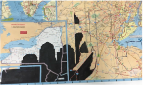
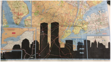
maps update
After I filled in the skyline with the sharpie the picture definitely needed more. I decided that I was going to color in the buildings with prismscolor colored pencils. I think the hardest part for coloring was finding where the lower buildings that don't show up on the outer part of the skyline. After I did the twin towers and the buildings around and below it I wasn't sure if I wanted to keep going or just have that. I think if I do the whole thing it might just be to busy and there won't be a focal point. If I keep it with just the highlight over towers area it lets the viewer know what they're supposed to be focusing on.
Maps
|
|
|
For the maps project first I didn't know what I was even going to do. I was at my art Intership when I thought of an idea. I had a map of New York and I thought why not draw something that people always associate with New York. What is the most main stream object (or in this case objects) everyone thinks of when they think of New York???? The twin towers of course. First I found a sky line picture Ft. the twin towers and placed it in a way where it covered New Jersey and allowed New York City would be seen.
I next traced out the skyline onto the paper. One thing I saw when I was looking up ideas. There where a couple faces I saw the wer drawn on the maps. but the roads overlapped onto there face. ans i thought that would be cool to do to the buildings.
I next traced out the skyline onto the paper. One thing I saw when I was looking up ideas. There where a couple faces I saw the wer drawn on the maps. but the roads overlapped onto there face. ans i thought that would be cool to do to the buildings.
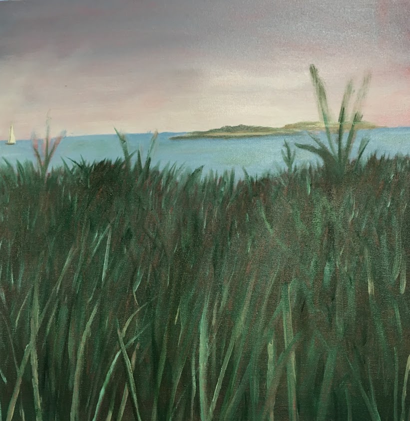
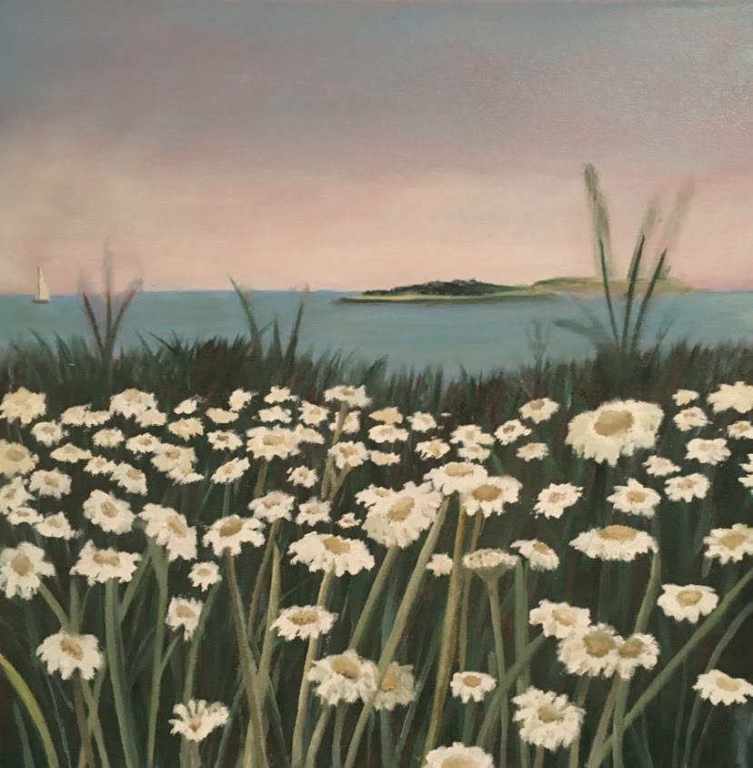
landScape
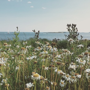
With this project we needed to make a landscape picture. I chose a picture that I took in Maine at the Port Clide lighthouse. There were rows of these white flowers with the ocean and the islands in the background. I started out with a orange red acrylic wash in the back. I started by marking out the lines where the sky and the ocean met, then where the green overlaps the ocean. I first painted the sky with an ombre blue to white layer. I next put the ocean in with a darker blue color. I ended the ocean on the line were the green starts and after ward filled the green just to get the background color. After that I went in and put in some grass texture.
When I sarted the flowers I kind of put them in there randomly. I don't know if I want to keep all the flowers or if I want to go into the pallet knife and make it better, because the white flowers are looking to fake. With all the detal I think a more impressionistic look. I also have to go into the back and do the plants that over lap the ocean. I was so focused on it I totally forgot to take progress pictures. I'm not all the way done with it so I'm going to update how I feel about the final when I finish.
When I sarted the flowers I kind of put them in there randomly. I don't know if I want to keep all the flowers or if I want to go into the pallet knife and make it better, because the white flowers are looking to fake. With all the detal I think a more impressionistic look. I also have to go into the back and do the plants that over lap the ocean. I was so focused on it I totally forgot to take progress pictures. I'm not all the way done with it so I'm going to update how I feel about the final when I finish.
|
|
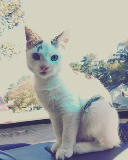
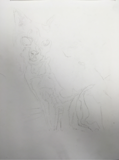
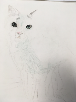
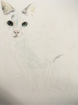
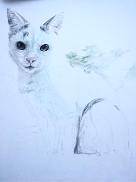
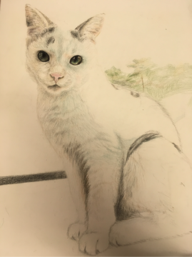
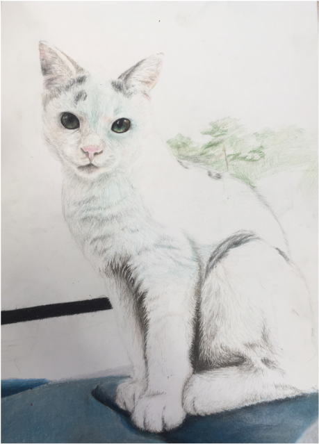
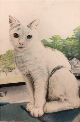
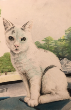
AniMal portrait
|
|
For this project we had to draw a pet portrait with any medium we chose. My boyfriend took this picture of a cat he found and that we took care of named sneakers. I decided to draw with prismacolor colored pencils. First I started out by grayscaling and posterizing the original picture to get the correct value and proportions. I started out with the eyes, because they were the darkest focal point of the picture. I really like how well they came out they have so much depth. Next I continued with the face going up to the ears.
|
|
|
|
I really like how the greenish-blue light that comes through the window onto the fur. It brings out the color in the eyes. I feel like the hardest part of doing the fur was giving it a soft, but realistic look. I achieved this by defining little white hairs with dark shadows.
|
|
I really liked how this picture turned out. I really want to go back into the trees in the background to make them a little more realistic. I also need to make the sky less blue, because I ended up making it a really vibrant blue.
self portrait
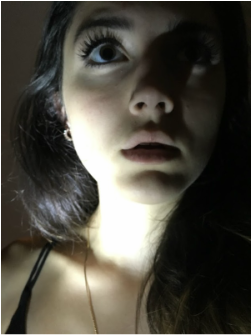
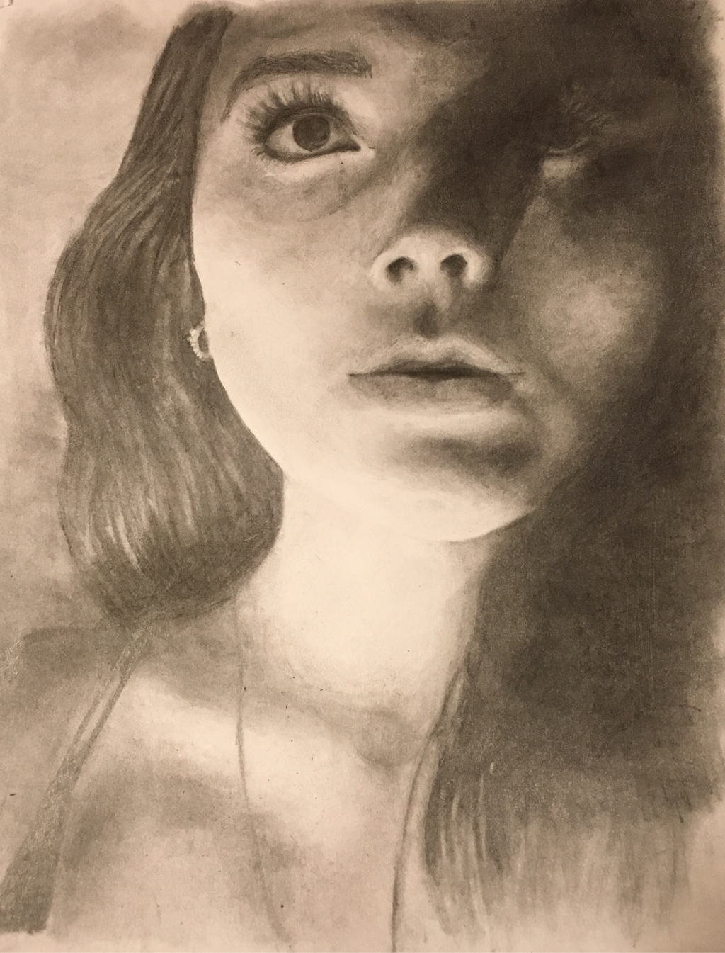
This unit we were supposed to create a portrait or ourselves using any 2D medium. I chose this picture of me featuring dramatic lighting, because of the intense contrast. To start this picture I put it into Photoshop and I grayscaled it then posterized it. This helps define the layers or value. When I printed it out I filled in the back Of the paper with charcoal. I layer the charcoal side down on the paper I was going to do the drawing on and traced out the defined lines of the layers. This works, because the graphite on the back acts as a way to transfer the image. When you press down on the front of the paper the graphite on the other side transfers to the paper below. When I draw with pencil I start with the dark areas first. With this one I started with the hair and the eye. After that I went down to the neck area and came back up to the face just with shading and then I filled and exaggerated the details.
The I didn't really take progress picture, because I draw the picture so quickly. I think it was easier to draw with that dramatic lighting. The lighting made it easier to see the shapes in the face making it easier to put them down on paper.
Compared to my other pencil drawing this one isn't my favorite. I feel like I need to lighten some of the image. Also the proportions of the face I feel are just slightly off and it makes my face look fatter than it is (or maybe it is that round in that case it's on point).
I think what I really learned from this was that I need to take pictures probably every hour or so just to keep up with myself. I also learned that even though people say don't be afraid of the dark, referring to dark shading, I think I shouldn't get to comfortable with the darks. The details and just the over all image kinda gets lost in itself. I definitely think I'm going to go back and change things sometime in the future just to improve it.
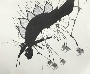
inktober
So for this small project we were with our mentees. We all had a straw and a little cup of ink. To start we put a few drops of ink on our paper. We the blew the ink around randomly with the straws. With the shape we came out with we were supposed to make a character or unique picture. I had a lot of ink it spread across the page so I blew perpendicular to the line I already mad which made the little leg like lines. I filled in the one big line to make the body added eyes, Spiky spine, hands and shoes. His name is Landon.

|
|
menteeeeee
My mentee's name is Abigail Frances😺. She's in her firsts art class at Apex. She said at the time her favorite medium was acrylic paint. She doesn't know if she wants to continue with art all throughout high school, but I have her some tips on what classes she should take depending on what kind of art she wants to do. Her art blog is http://abby-apex-2020.weebly.com/
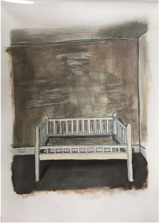
interior sPaces
|
|
|
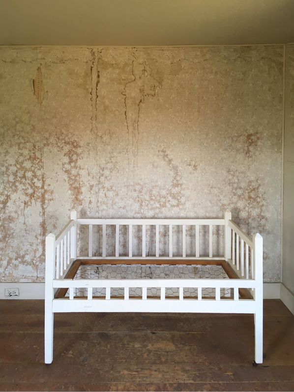
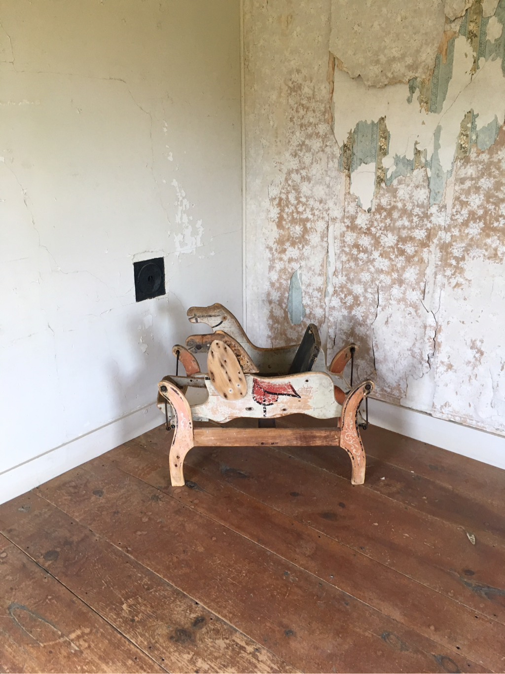
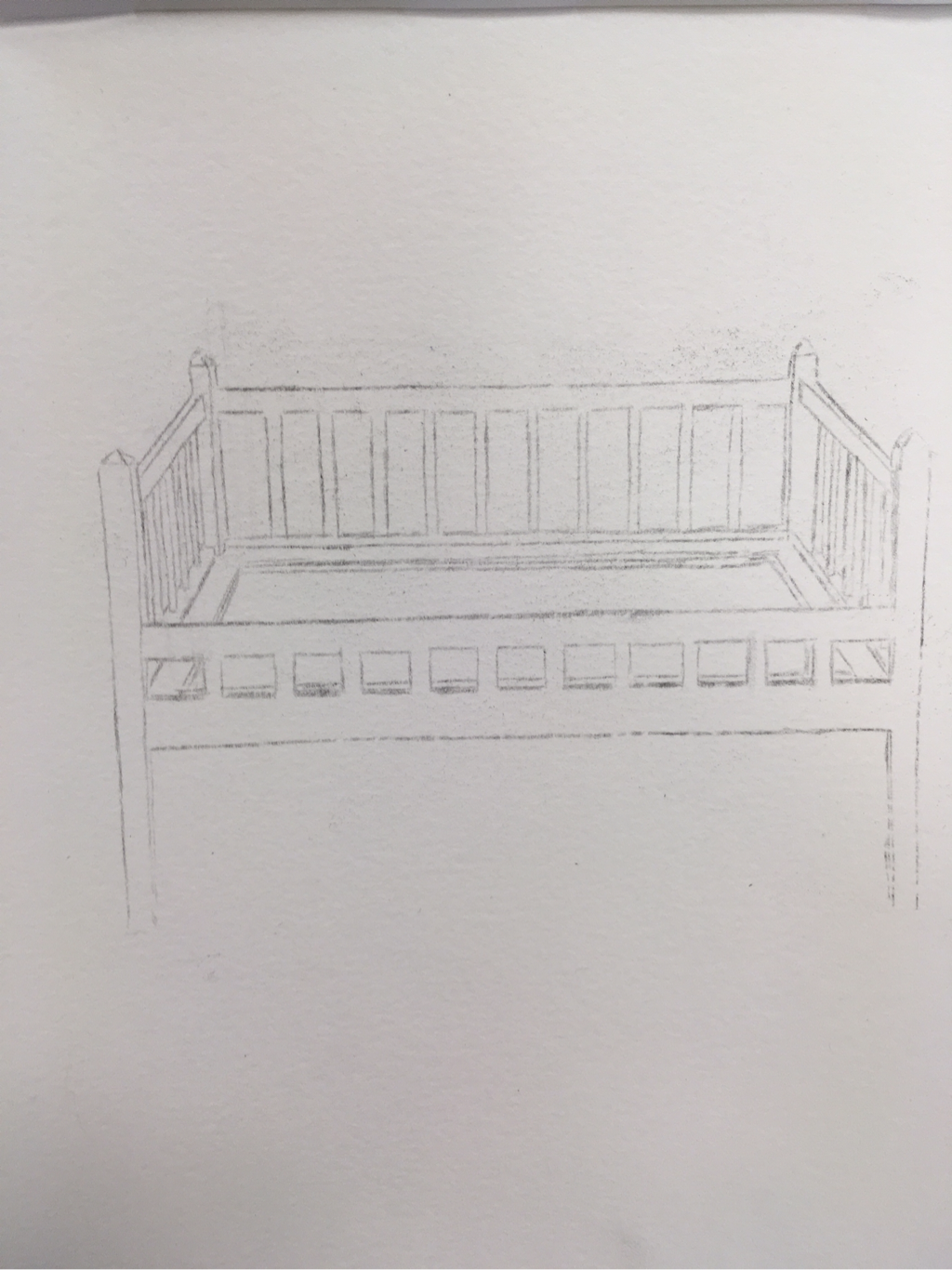
So for this project we had to take a picture of an interior space then create it using our preferred medium. These are the three pictures I chose from. The one with the crib and the rocking horse are actually from the Olson house in Maine. The last one was from my grandparents house. I decided to chose the one with the crib, because of the creepy vibe and the monochromatic color scheme.
|
|
At first I did it with pen and watercolor and it looked to cartoonist. After I covered the watercolor with acrylic and it just didn't seem to blend or look right. The acrylic was very flat and it was hard to make anything seem #D on the page I actually ended up going with oil paint. It's so much easier to blend and add on even if it takes a while.
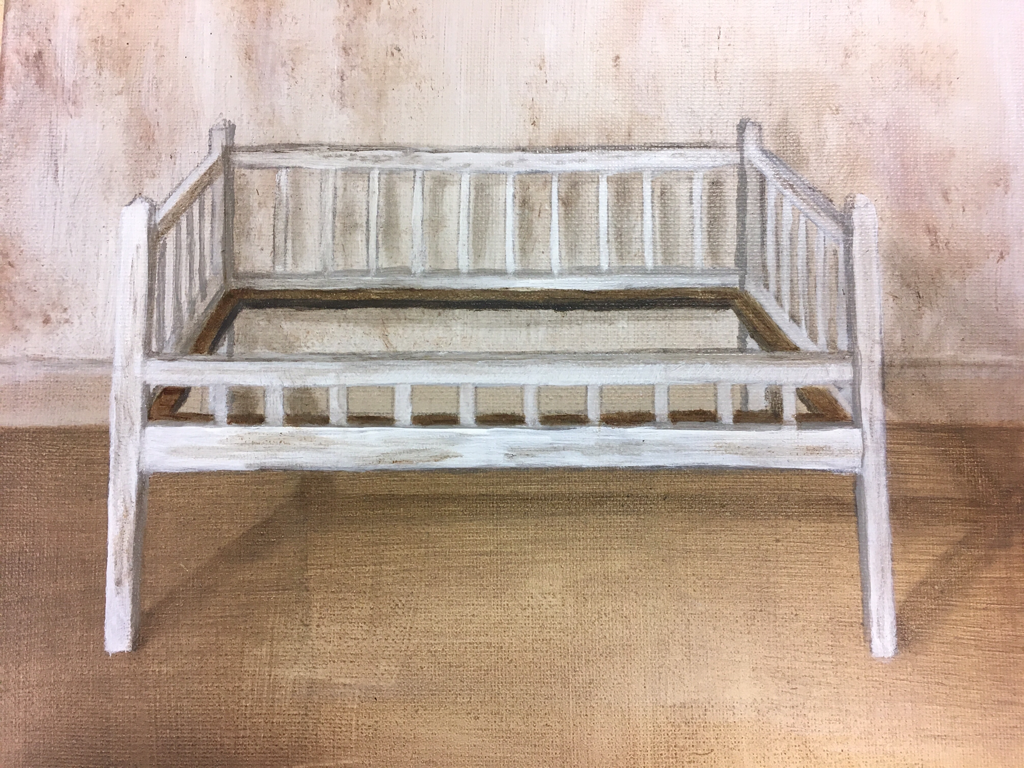
Looking at the final project I like how it came out it gave off the 3D effect then the first two other tries. I would really like to go back in and sharpen up the edges on the crib and the bottom part of the wall. I do like the color scheme of the whole painting, because it is a constant creepy and mysterious feeling throughout. Also i love how even though the colors are all close they make each other stand out and it's easier to distinguish what is what, unlike the acrylic or watercolor where the colors were either too light or too dark
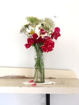
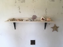
Oil painted object
|
|
|
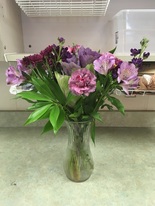
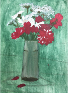
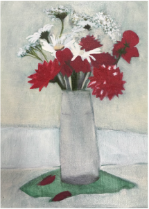
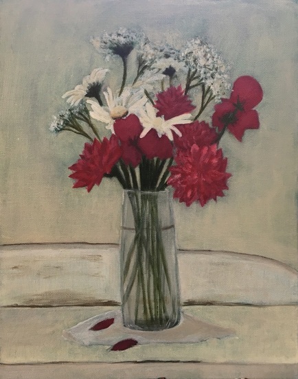
For this project we were supposed to take a picture of different everyday objects. I searched and found these three pictures. The picture of the red and white flowers and the one with the shells were from the Olson house in Maine where Andrew Wyeth painted a lot of his pictures. The third was a picture I took in my art class of some flowers my teacher got for her birthday.
Mrs. Rossi said she like the red flower picture against the white background the best. I traced out the basic proportions of it onto the canvas and used a green acrylic wash for the base of the background. I started with the white daisies, because the seemed to be the easiest to make.
I had a really hard time adding depth into the flowers and the shelf so it looks flatter than it should. I red flowers are the ones that need the most work, because they're so flat and don't match up to the other flowers. Other depth problems I need to fix are in the shelf. I need to make the shading more broad and not such a sharp line. I also need to go back into the napkin and add some detail and shadows. It's really hard to tell what it is, it is also very flat and it looks rushed. I really like how the top white flowers came out. I couldn't go in when I went in and painted the white background, but the green made it look great giving it depth and giving it a soft texture. The middle of the daisies the shadows need to be darker.
|
|
oIl painting practiCe
This little project was just a warm up to help us try out and get a feel for the oil paints. I think my strong point was definitely the brush over the pallet knife. I would really like to try the pallet knife again though just to see what I can do with it.
|
So these two pictures are
|
|
|
Prisma Reflection
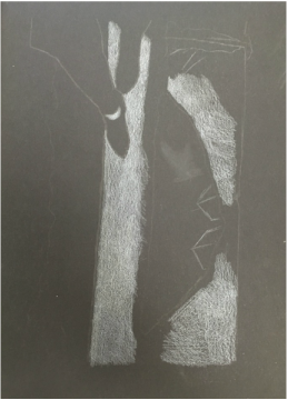
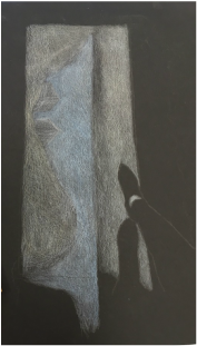
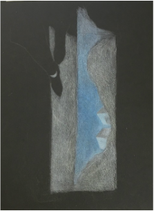
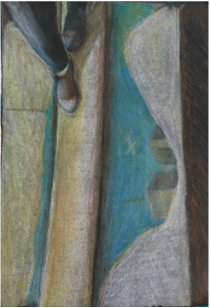
For this first project, we were told to make a reflection project (realistic of metaphorical) out of prismacolors. I was thinking about 9/11, because the week of is when we started the project. I wanted to take a picture of me looking down into a puddle that was reflecting a plane that is about to crash into the twin towers. I went outside and took this picture. I traced the basic picture onto a black piece of paper and began to layer and color. After awhile it just got really thick and was hard to blend. I ended putting a bunch of colors in making which made it looked flat and scared my art teacher. I decided just to erase it all and add more white. It just never went back to the way I imagined it to be. Maybe if I went in with some darker colors it would work out better.
|
|
|
|
|
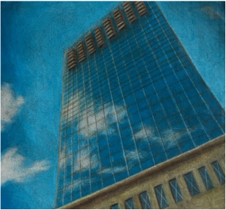
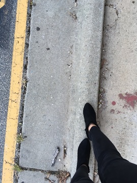
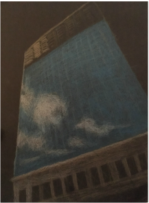
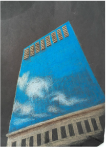
After that first epic fail I found this picture in my camera roll and started drawing it for fun in my other classes.
My teacher Allowed me to use this one instead of the old one, which I'm much more proud of.For this first project, we were told to make a reflection project (realistic of metaphorical) out of prismacolors. I was thinking about 9/11, because the week of is when we started the project. I wanted to take a picture of me looking down into a puddle that was reflecting a plane that is about to crash into the twin towers. I went outside and took this picture.
I traced the basic picture on to a black piece of paper and began to layer and color.
After a while it just got really thick and was hard to blend. I ended putting a bunch of colors in making which made it looked flat and scared my art teacher. I decided just to erase it all and add more white.
It just never went back to the way I imagined it to be. Maybe if I went in with some darker colors it would work out better.
|
|
|